The following is a glimpse of my work at BRYTER. The entire breadth and depth of work will be shared in a video call as it will take time to add it all here
Design @ BRYTER
BRYTER and my time there
BRYTER is a platform with a suite of tools that enable businesses' legal teams, compliance departments and procurement experts to automate their workflows, build applications, and, digitise contracting.
I spent a rich 1 year with the design team of BRYTER during which I worked on about 11 design problems. I'm not going to be sharing all of them here but will touch upon some of them to illustrate howI approached and solved the problems I was handed.
My contribution
Projects I will touch upon on this page (WIP):
•Quick Check
•Custom Date Format
•Microsoft Word Add-in
•Collections
•Variable Transforms
•Theming Re-organisation
•Brand Center
1/ Quick Check
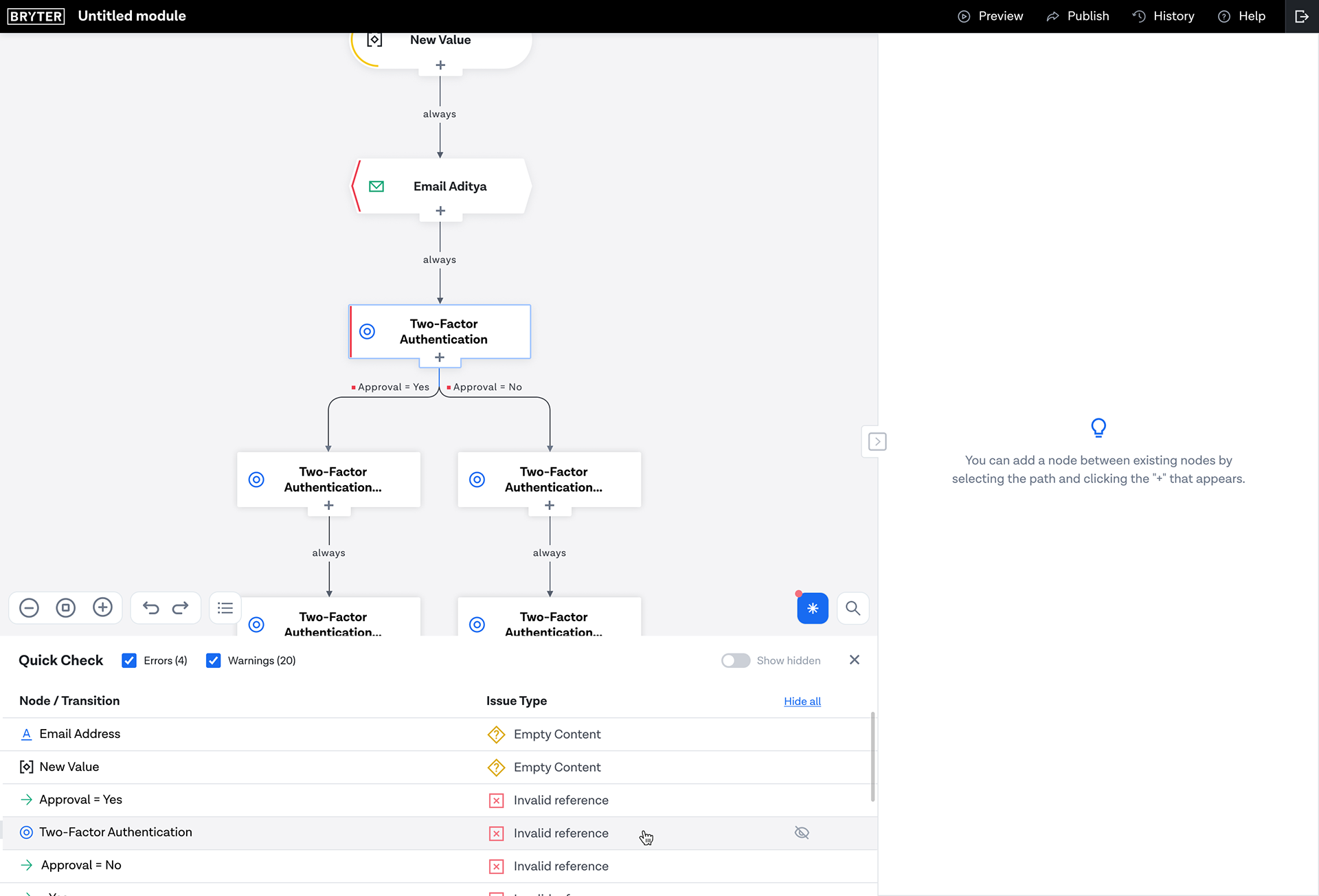
This was my first project at BRYTER - an onboarding project in quite a true sense, since it got me diving deep into one of the key elements of BRYTER - the graph editor.
Problem Statement
Node authors need preliminary feedback on the validity of modules. So far, they’ve had to run a module in preview mode to progressively know all the issues with it. This is a tedious process. They could use a way to perform a ‘quick-check’ on the graph without previewing the module.
Solution Considerations
The UI should indicate to the user, issues in 2 forms:
•Errors, which are non-negotiable
•Warnings, which may be ignored
For ease of viewing and addressal, the interface will present the issues in 2 forms:
•On the graph
•Consolidated as a list
For ease of navigation, the interface can provide quick association of the listed issue on the graph through highlighting it.
Solution proposal
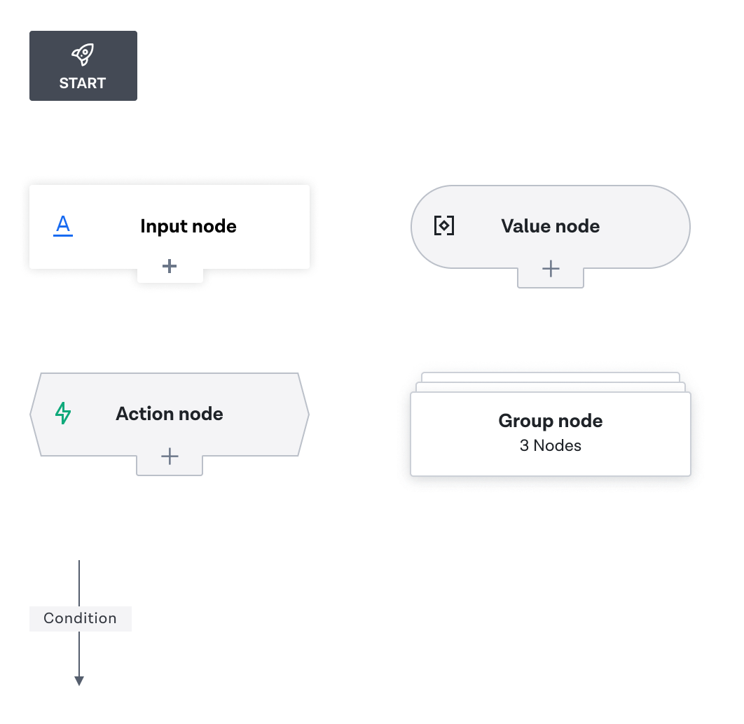
There are 3 elements at our disposal for effective communication in the interface:
1. Color
2. Text
3. Iconography
1. Color
2. Text
3. Iconography
Questions
1. How will the representation on the graph work with the different node types?
2. How will it blend with the nodes?
3. What are the distinct advantages of representing issues on the graph?
4. How will the representation system work equally and in coherence for both the node and the transition
2. How will it blend with the nodes?
3. What are the distinct advantages of representing issues on the graph?
4. How will the representation system work equally and in coherence for both the node and the transition
Considerations
1. Shapes of nodes
2. Text present on condition
2. Text present on condition

Visual design for how transitions display errors and warnings associated with them

Visual design for how the nodes on the graph will display errors and warnings
Consolidated list of issues
Questions
•How will the list complement the graph view?
•What are the distinct advantages of a list view of the issues?
•How will the architecture of information influence the display of elements in a list?
•How will transitions linked to a certain node be indicated in the list? Or, will the link be made visible at all?
•What are the distinct advantages of a list view of the issues?
•How will the architecture of information influence the display of elements in a list?
•How will transitions linked to a certain node be indicated in the list? Or, will the link be made visible at all?
Considerations
•Shapes of nodes
•Text present on condition
•Information to be displayed in the list element
•Both a node and the transition can have issues linked to them
•Display of hidden issues, selected issue and highlighted issue
•An empty list state and messaging
•Ability for the user to show/hide errors and warnings
•Coherence with other parts of the editing UI
•The mental model of inspect mode for most browser users
•Display of input nodes inside WYSIWYG editor
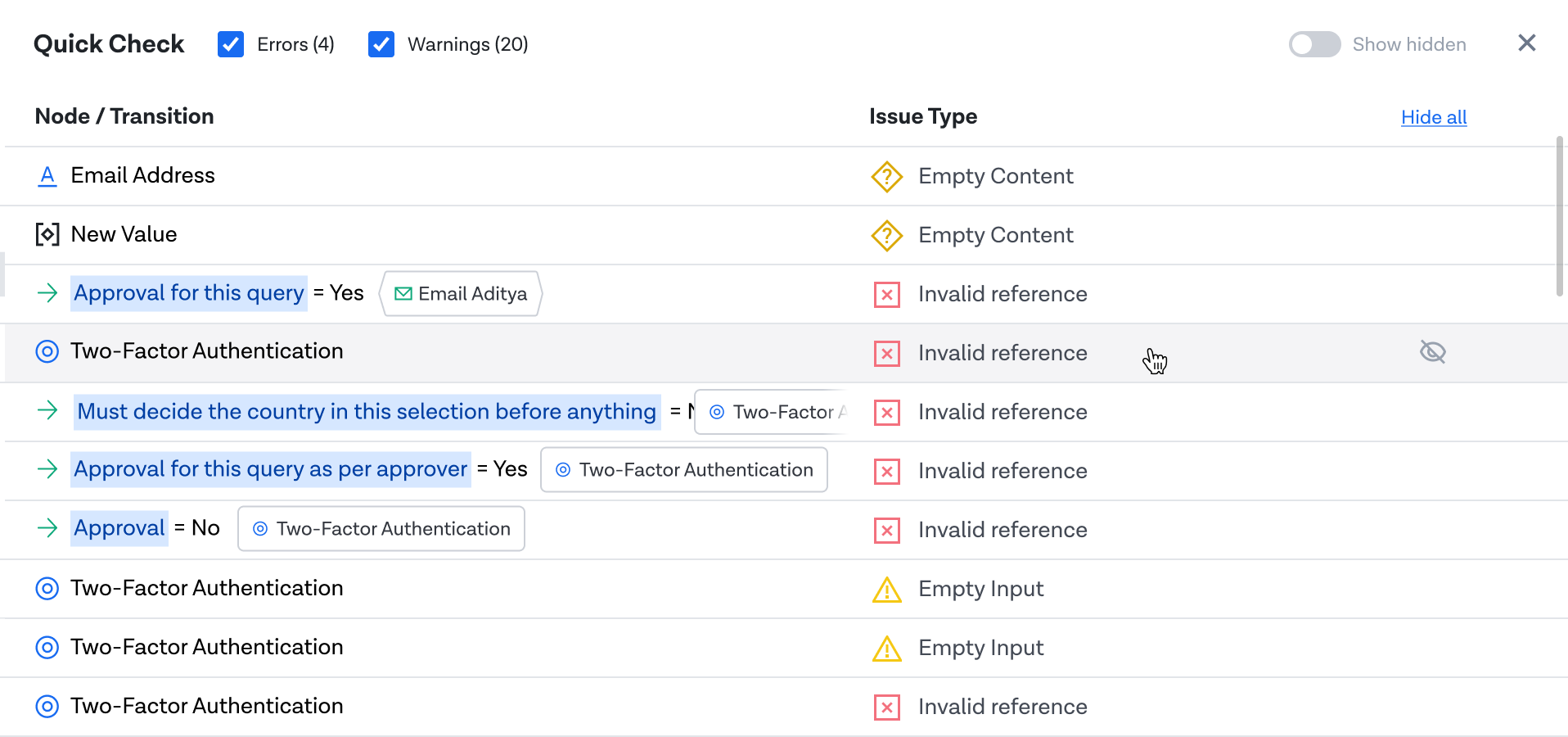
The above exploration displays nodes accompanied by the transitions that are linked to them.
For each transition, the node that it is linked to, is indicated.
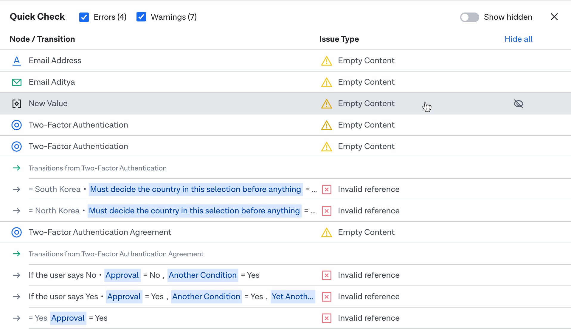
The above exploration further displays the transition text and the condition added to it with the representation of a node in the WYSIWYG format. There is also a grouping of transitions linked to the same node and a heading indication for the same.
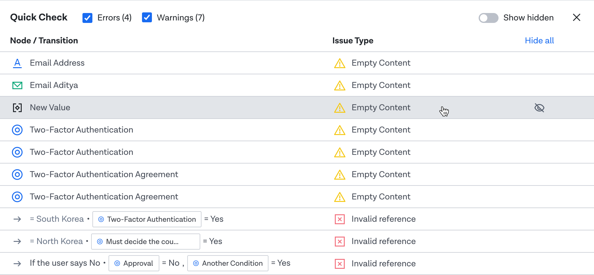
The above exploration uses a mixed representation of a node, one of the graph and one in the WYSIWYG editor
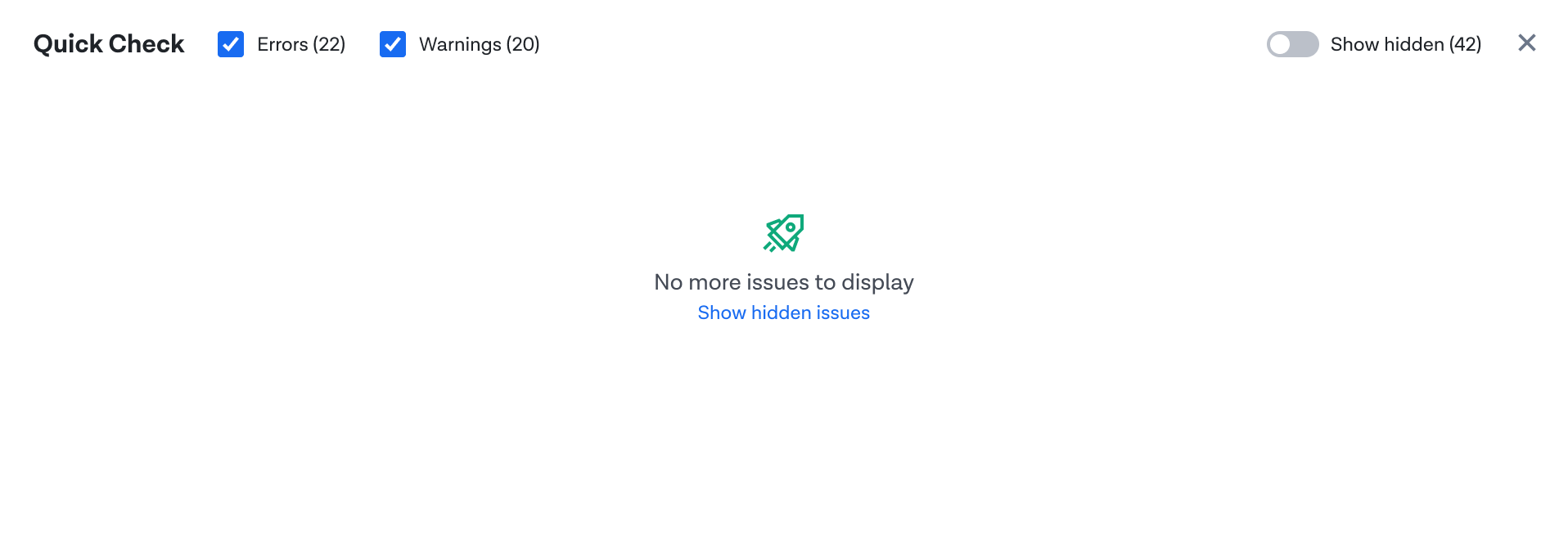
An empty state view for when there is no error or warning to be displayed
Overall look 'n feel