
Internet. Business. Chaos.
Problem Statement
Design of a minimal new-age journalism platform
My Role & Contributions
I led team FOLO that worked on the brand and interface design of The Morning Context. The overarching task was to design a canvas on which they would tell their "ambitious, timely, deeply researched and well-written stories".
1. Brand and Identity Design
2. Web Experience Design
Outcomes/Successes
•The design gave TMC a great springboard and they soon got selected for the 2020 Google News Initiative Fund.
•Not just the Google News Initiative fund, TMC was able to raise funds from other angels soon after the launch of v1.
•The TMC team and FOLO co-wrote about the making of TMC on the site too!
Background
The premise
Beginning with three words: 'The Morning Context', The stories were to be fit in 3 broad categories as a constraint: Internet, Business and Chaos. A design constraint laid upon us was that the visual design had to be minimal.
Principle for design
The client expressed early on that they needed a minimal design scheme. This obviously helped constrain us. The 3 elements that we chose to work with, keeping with the overarching principle of minimalism were:
1. Colour
2. Typography
3. Space
Branding
Colours
Since the journalism was constrained to fall under 3 topics, and minimalism was the underlying philosophy, we decided to use create the brand with the help and use of colour.
For the 3 themes of Internet, Business and Chaos, we chose 3 core colours. Alongside, we chose a deep blue to present the typed elements as well as backgrounds in the UI.
Orange, as a warm colour was used to represent the internet.
Green for Business is a no-brainer, a simple association.
Purple is complementary to Orange and we chose it for Chaos.
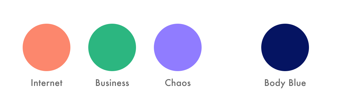
Orange, Green and Purple represented Internet, Business and Chaos
Branding
Typography
We identified 3 key areas where typography would play a role:
1. The identity of TMC
2. Themes
3. Storytelling
Typography for identity
We chose Matteo as the signature brand typeface for its geometric, bold and sharp form. It also fit perfectly in the minimalist thought and created a fine statement as a logo text.
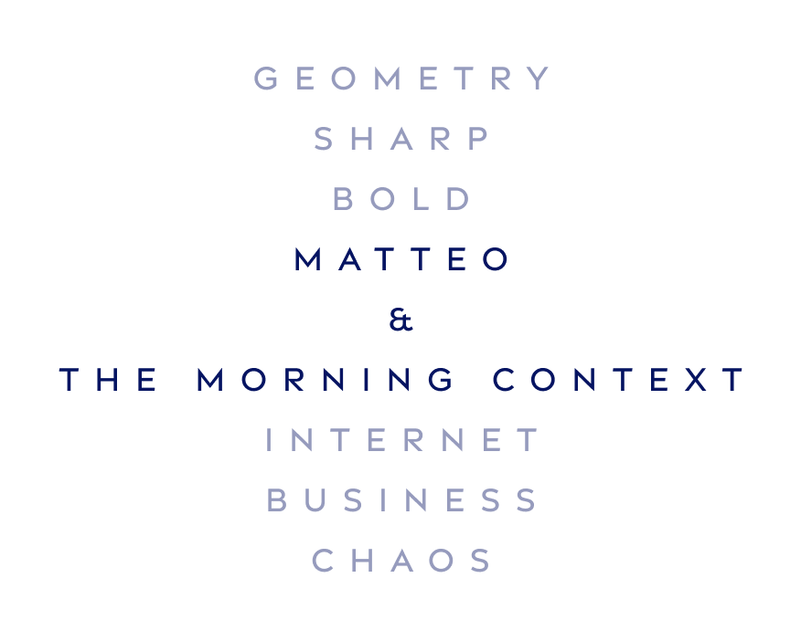
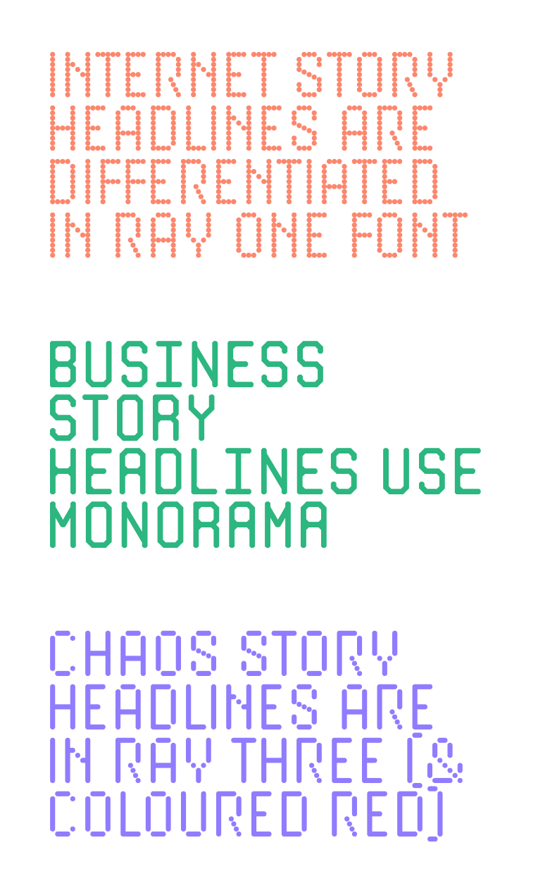
Typography for themes
We chose the Manorama and Ray series of fonts for their hybrid appeal of being rooted in the digital aesthetic, yet being playful when contextualised to modern displays.
Manorama, Ray One and Ray Three was used to visually present the title of stories for Internet, Business and Chaos. The key elements of these typefaces which we felt matched our requirement were zaniness, a sense of connectivity in the form and a bold form that imparted a unique identity to TMC's themes.
Typography for storytelling
Passenger Sans, for its subtle contemporary grace and readability, was chosen as the story text font.
Branding
The logomark
The 3 themes of TMC's reporting inspired us to develop the logoform as well. In the spirit of minimalism, we combined the 3 colours with the form of the sun, to create an abstract composition that became the TMC identity.
The reader of TMC will wake up and get their morning emailer from TMC, to read the story of that day, as the sun rises. This is what gave us the idea of using the Sun as the defining element for the TMC identity.
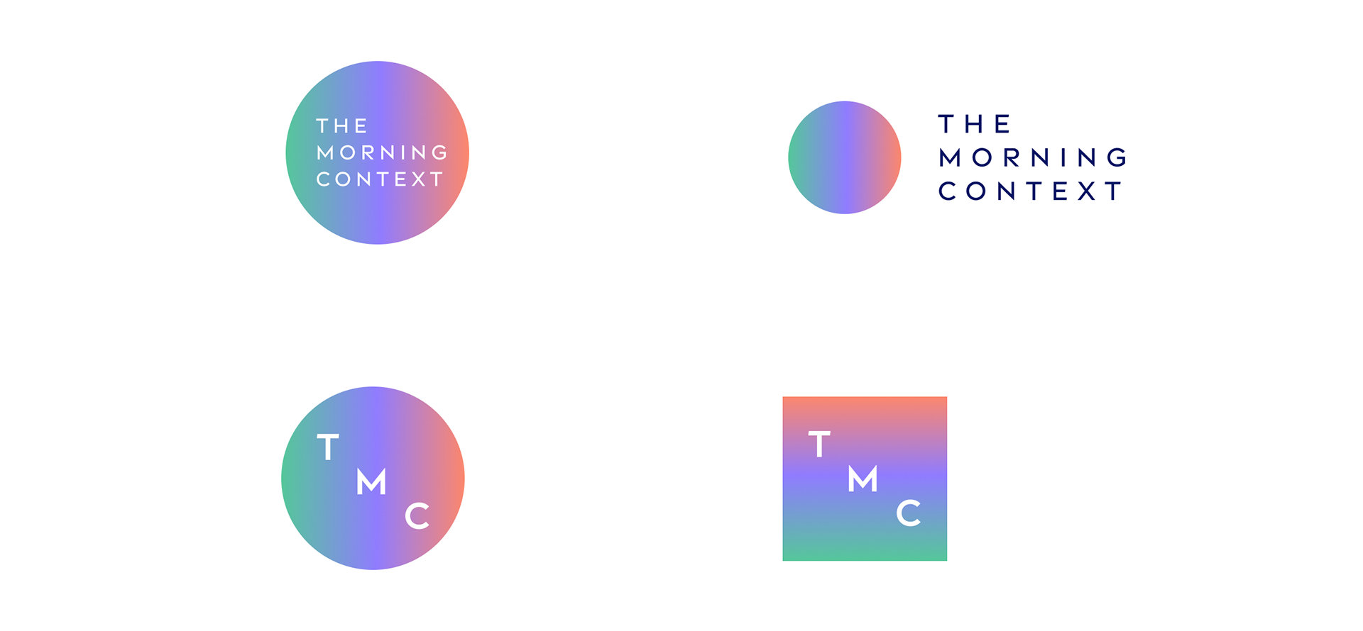
Identity variants for TMC, with the Sun as the key element
Branding
Business cards
We also created business cards for the team members, bringing in more play into the use of space, this time for print.
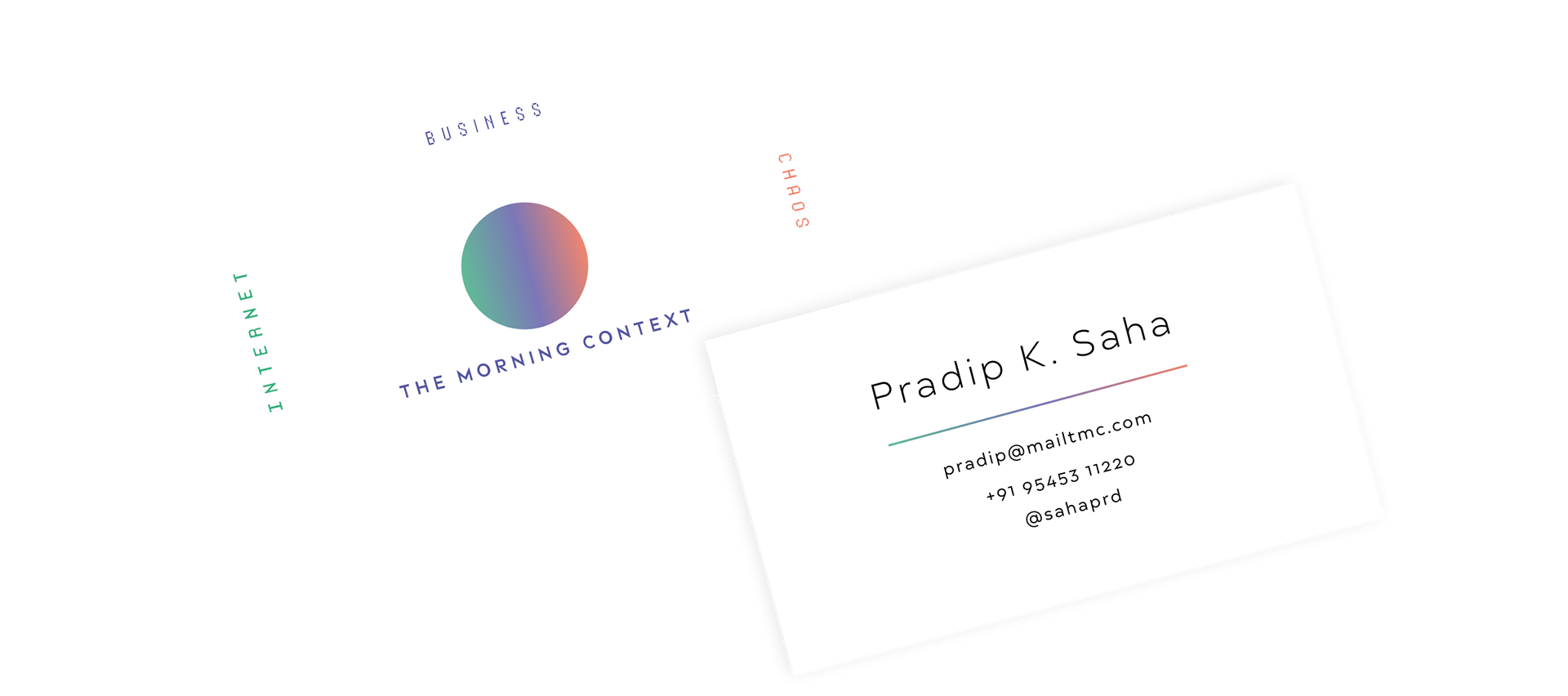
Business cards for the team members
Journal design
Minimalism & Space
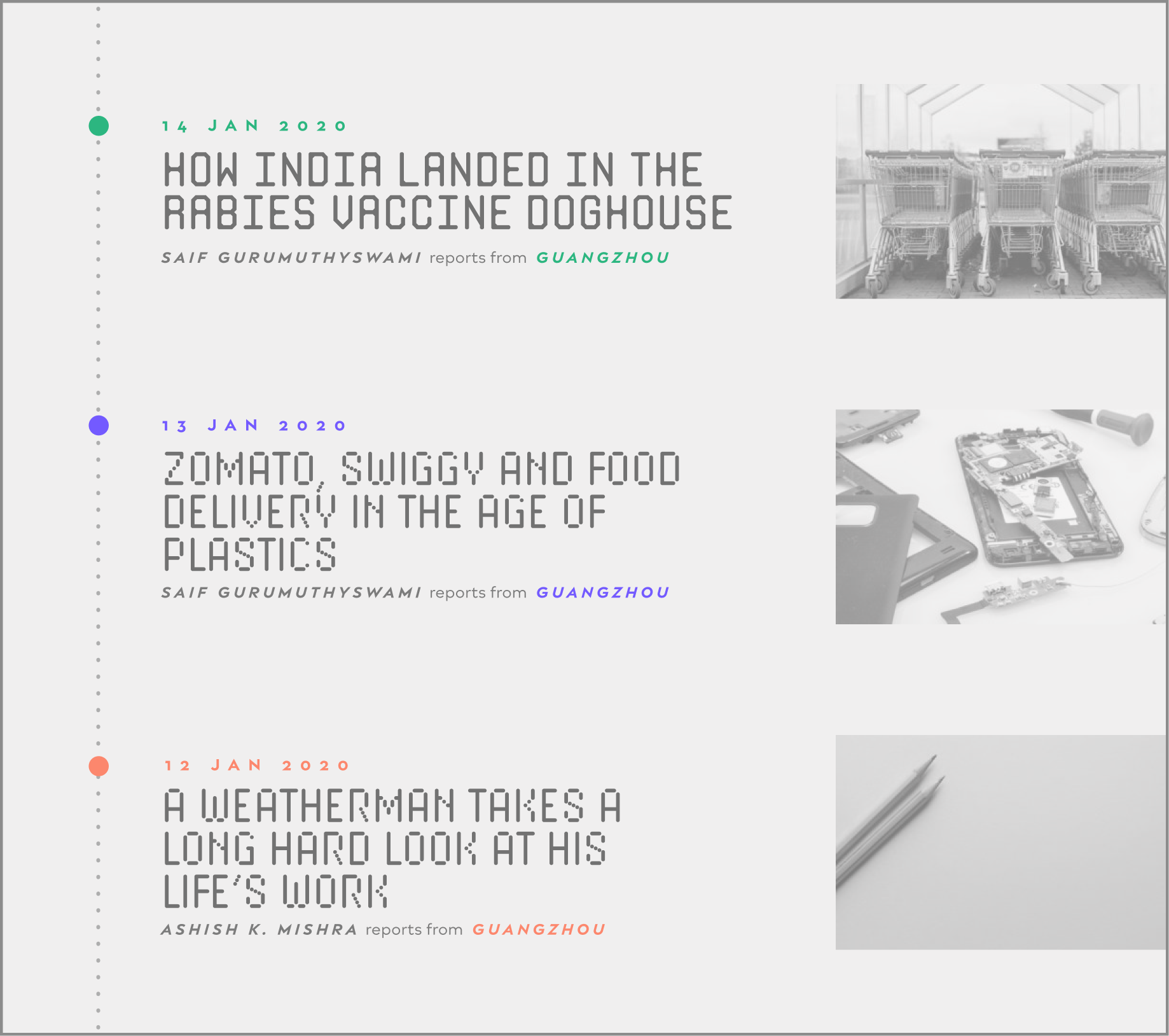
Keeping with the themes and TMC's methods of publishing weekly (a story a day), we chose to play with space to indicate the chronology of stories:
A Story a Day: Internet, Business & Chaos on a timeline
We chose to represent a 'timeline' with coloured markers of stories about internet, business and chaos, to indicate stories chronologically, in the current week.
Apart from the timeline marker, the date and the location follows the theme colour too.
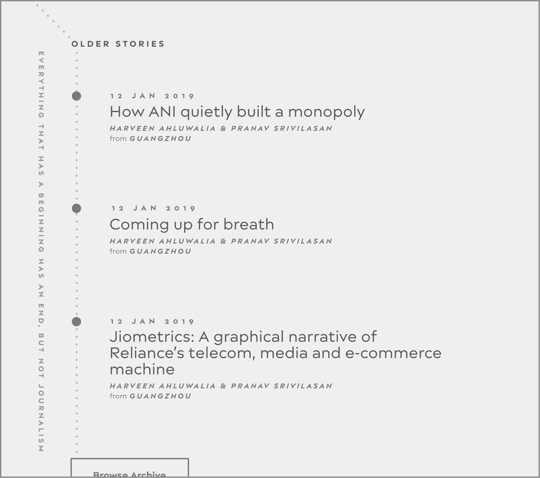
Bending timeline
The timeline took a 'detour' when the reader would, while scrolling, switch from this week's stories to older week's stories.
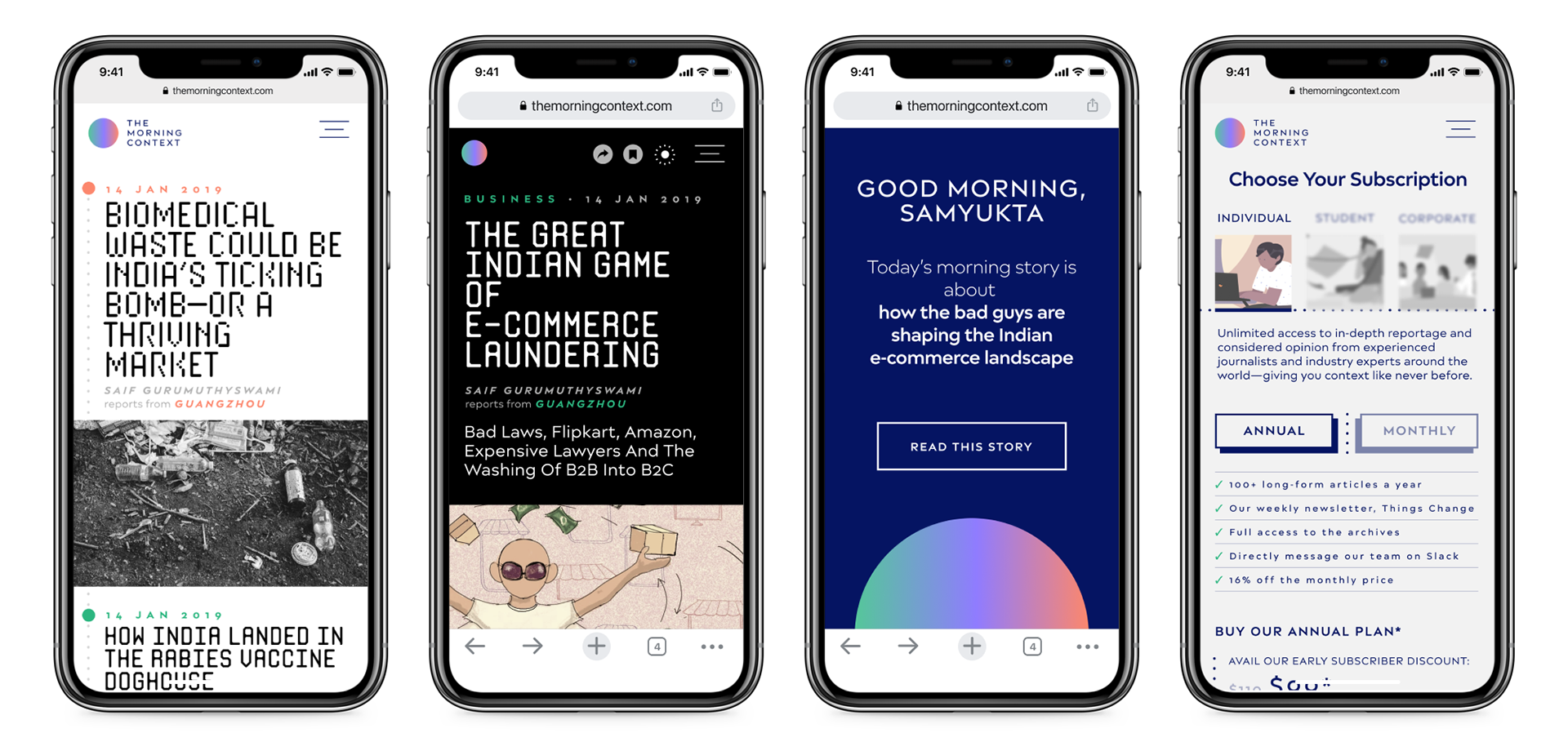
A few snapshots of how TMC appears on the mobile
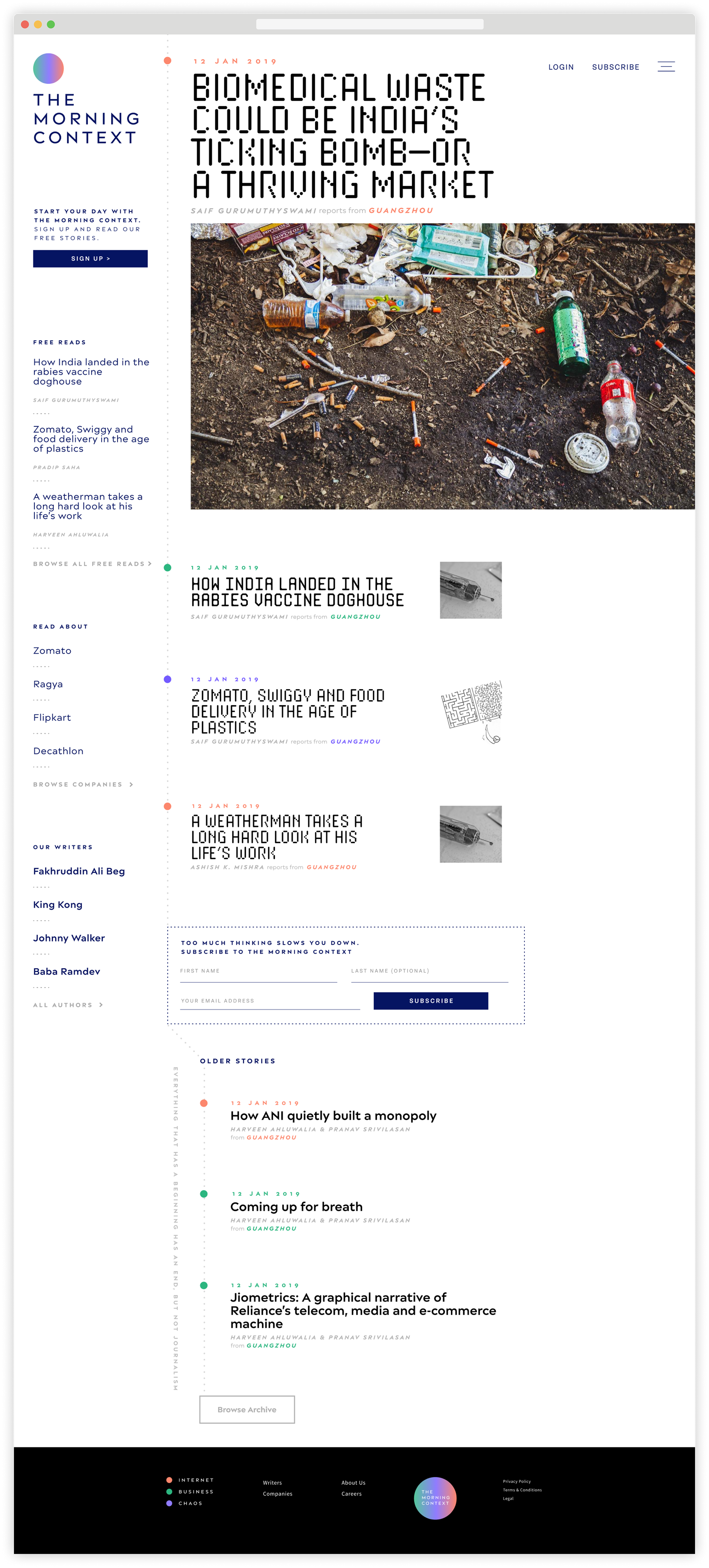
Landing page for the journal
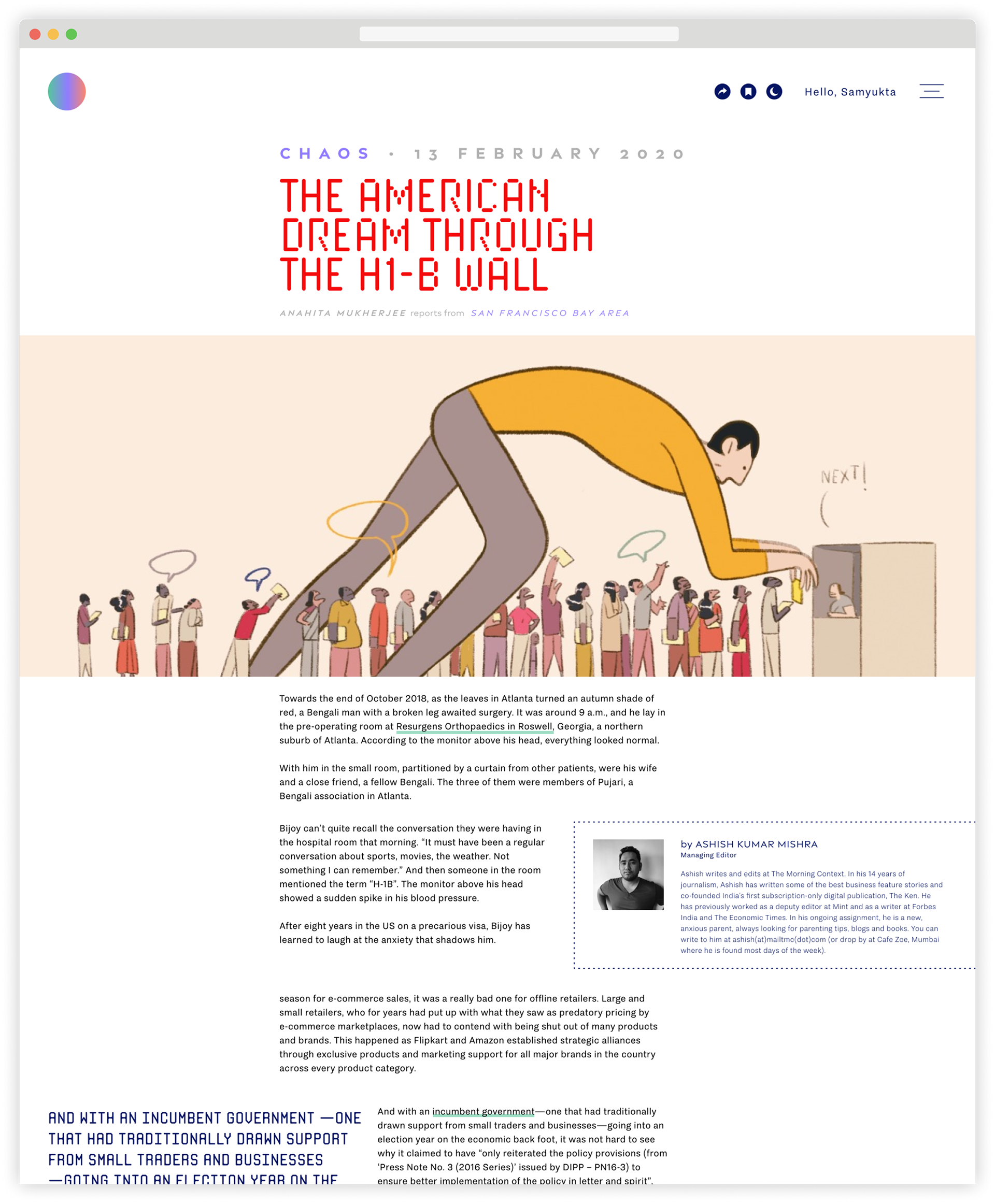
The story page
Dark Mode for Easier Reading
Since this is longform, and of course readers spend time reading, we created a dark mode option in the story reading screen.
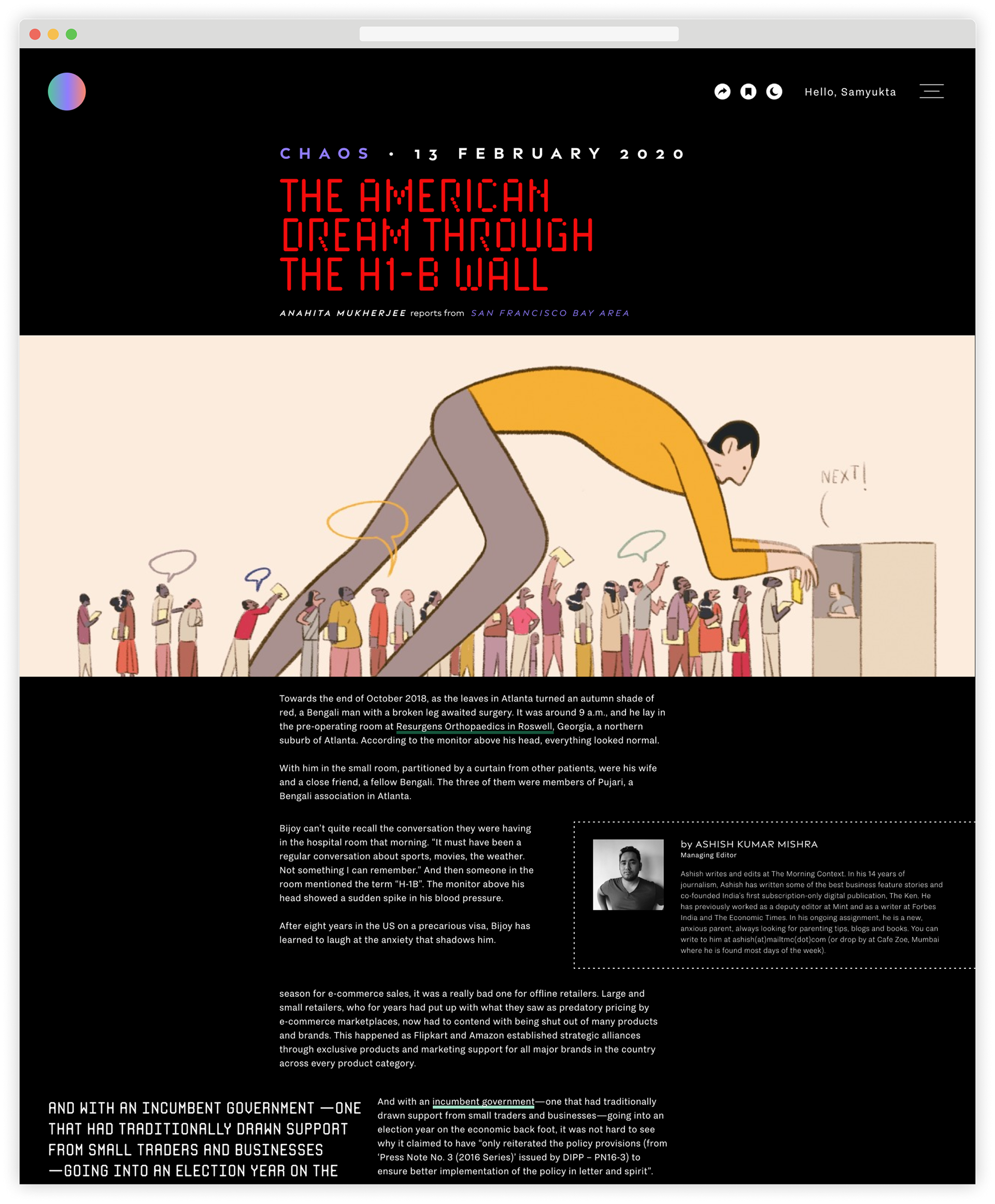
The story page in dark mode
Bold & Simple Search
The Search is not just a means to type and search based on a text string, but is also a means to navigate into the main categories of the site.
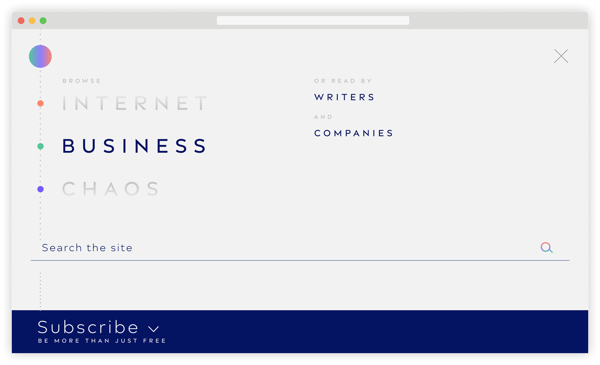
The search page
Monochromatic Theme Presentation
The stories in a single theme are presented in the colour scheme designated to the theme.
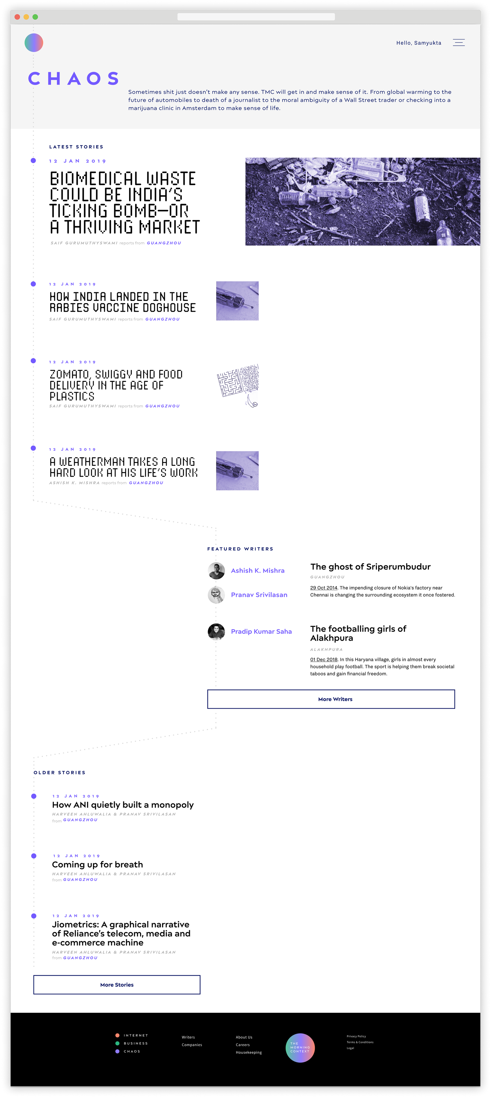
A specific category page, shown above is Chaos
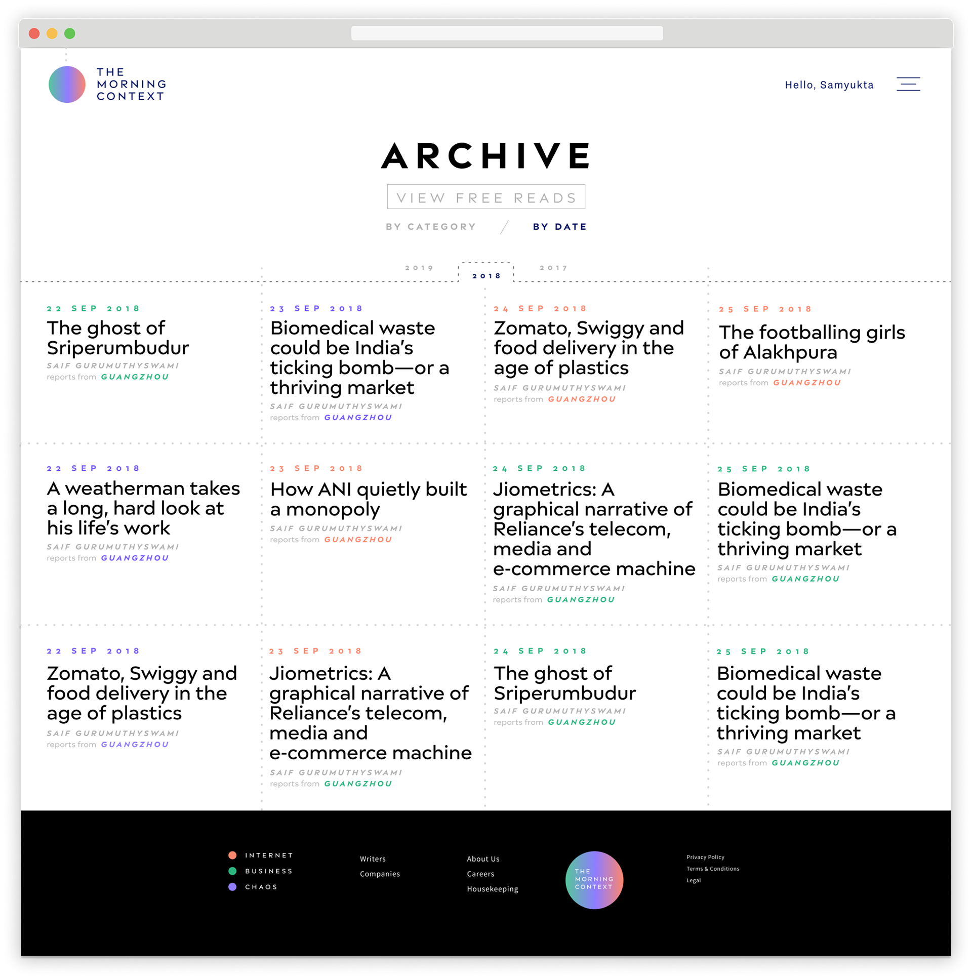
An Archive section which will host content from the past
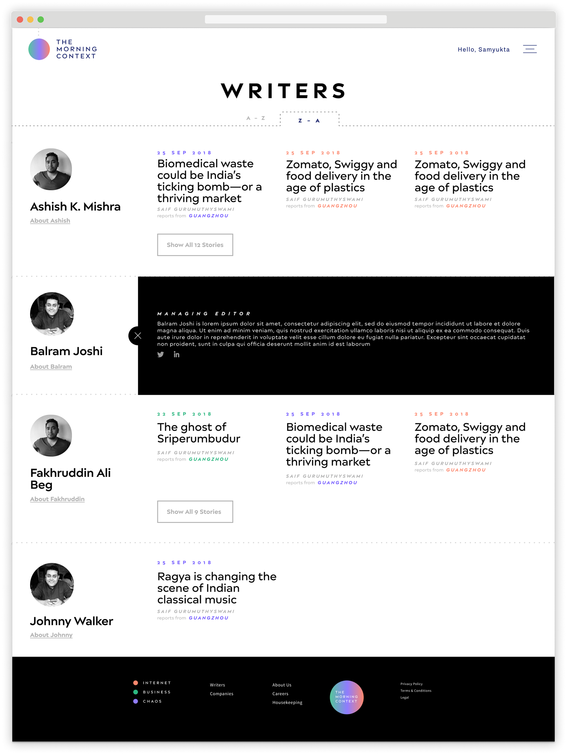
A page displaying all the writers who write for TMC
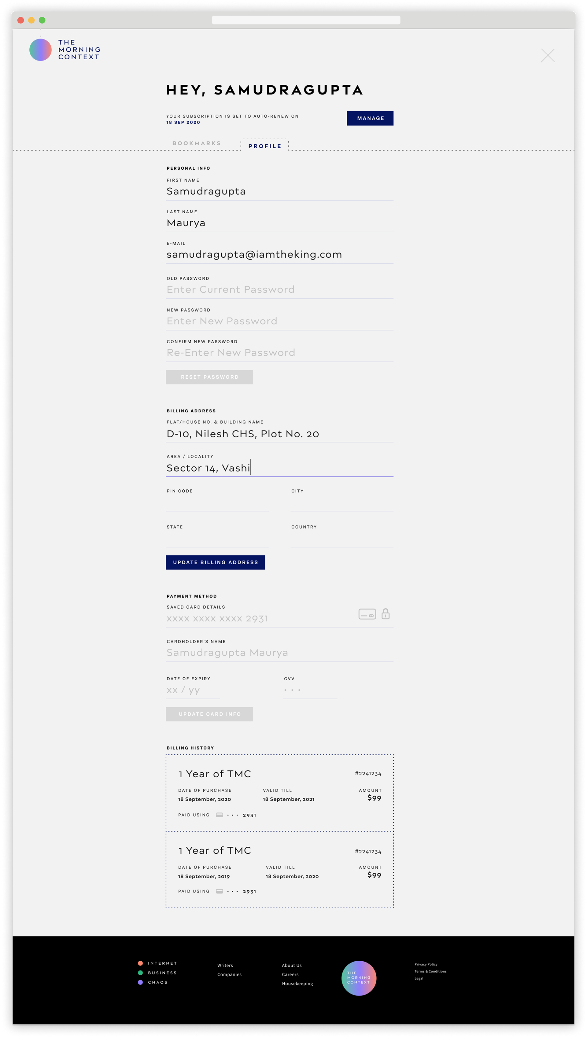
A reader's dashboard to manage subscription and profile information
Do checkout the brilliant stories on The Morning Context