Redesign of the Freecharge Identity
Consulting brand & identity designer•2012
Freecharge is a one-stop portal for anyone who needs to get rid of his worries related to everyday bill payments, mobile recharges etc. With the constantly increasing internet user-base, Freecharge is up-to-date and consistent across any platform it is present on. Freecharge is an advisor, a manager and a friend.
In 2012, Freecharge engaged me to redesign their visual identity.
Gathering perception through interviews
In interviews I conducted with 10 mobile users who used prepaid, it was understood that the 2 key values that they were commonly looking for in an online recharge service were speed and reliability.
Further, based on a Nielsen report that Freecharge had commissioned, more than 70% of the users were under 35 years of age. For this group, a sentiment study revealed that fresh and energetic were the other aspects that they would associate with a brand such as recharge,

The symbolism
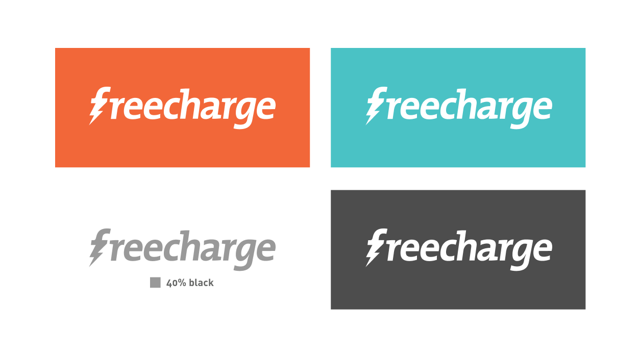
To embody the 4 key values and aspects of the brand - Fast, Reliable, Fresh and Energetic, I employed the modern lightning symbol coupled with the ' f '.
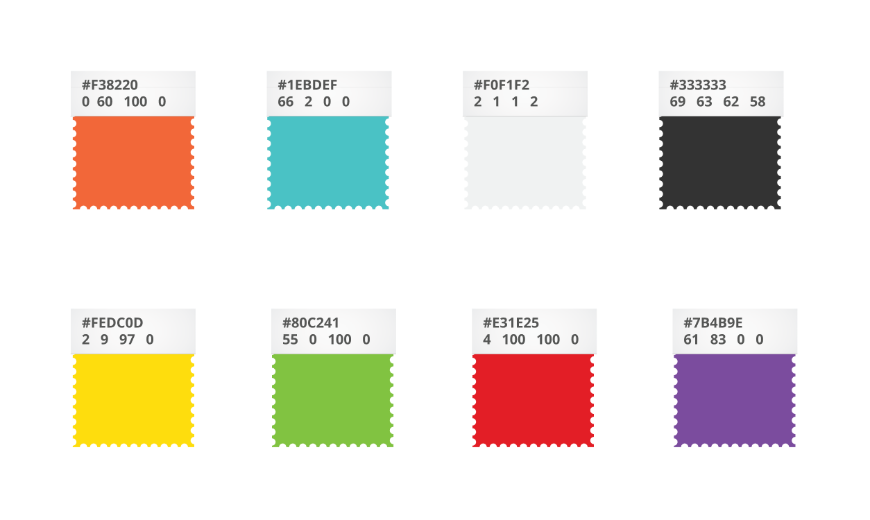
Further, an Orange and Cyan became the key colours for the brand to complement the lightning symbolism.

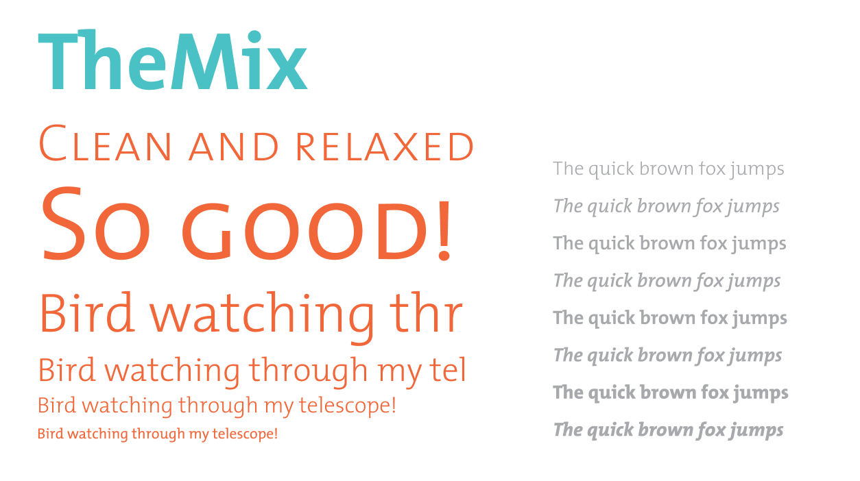
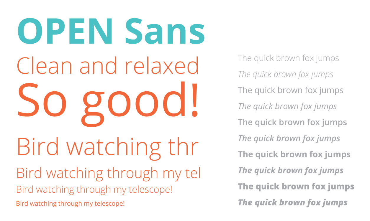
Guidelines for the brand
I created a comprehensive set of guidelines - typography, colour, layout, brand associations, do's and don'ts as guiding principles for the new identity.
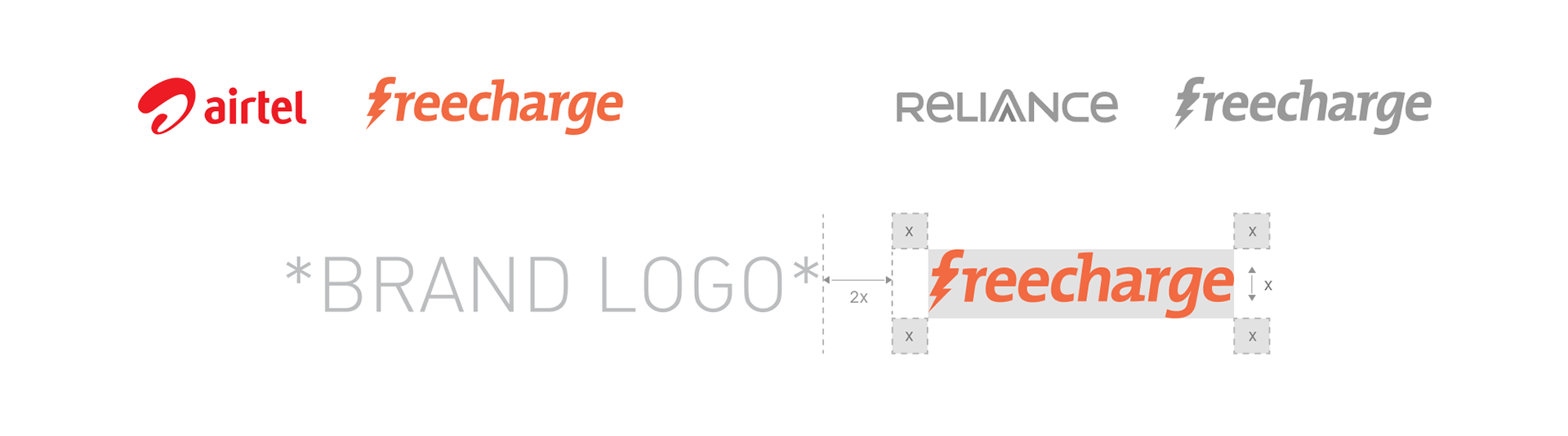
Brand partnering guidelines shown above
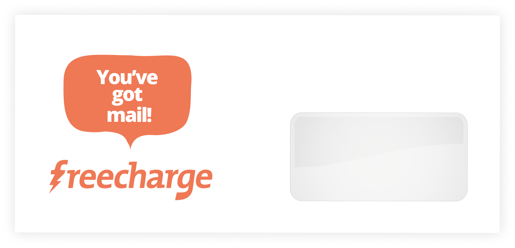
Frubble - The conversational accompaniment
I proposed brand Freecharge as an informally conversational one. This conversation aspect must reflect in all aspects and applications of the identity of Freecharge. For the purpose of bringing forward the conversational aspect, I created Frubble - a character visually in-sync with the identity of Freecharge itself.
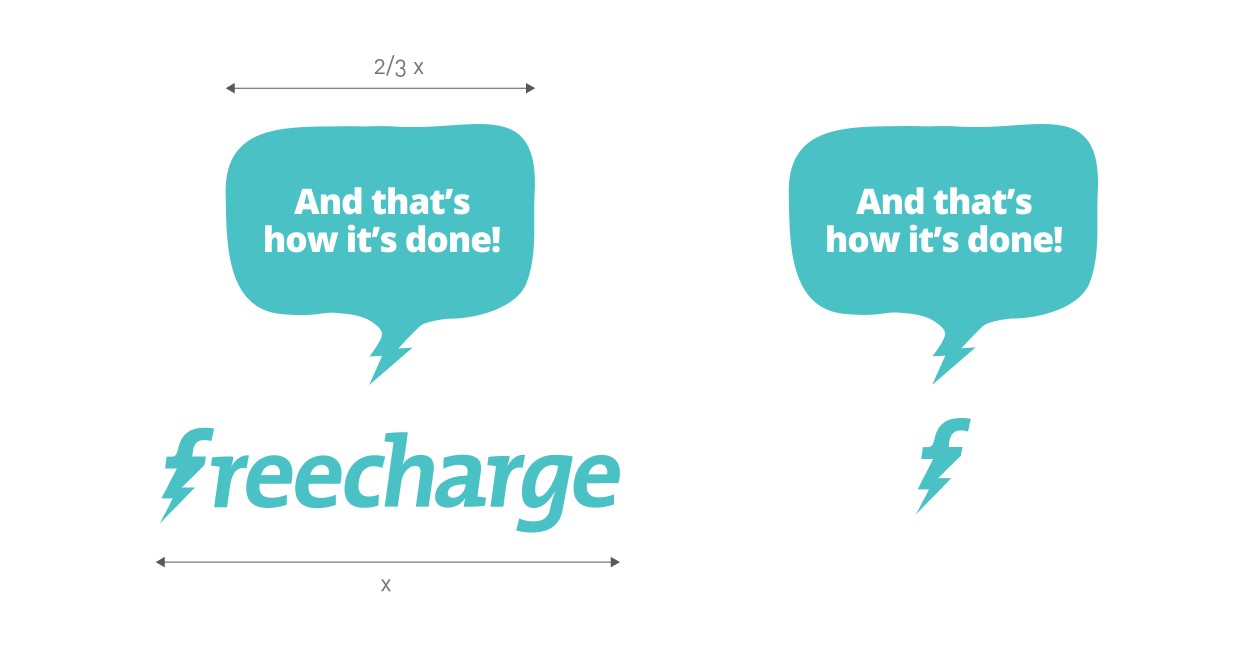
Usage of the frubble alongwith the full or partial logo of Freecharge
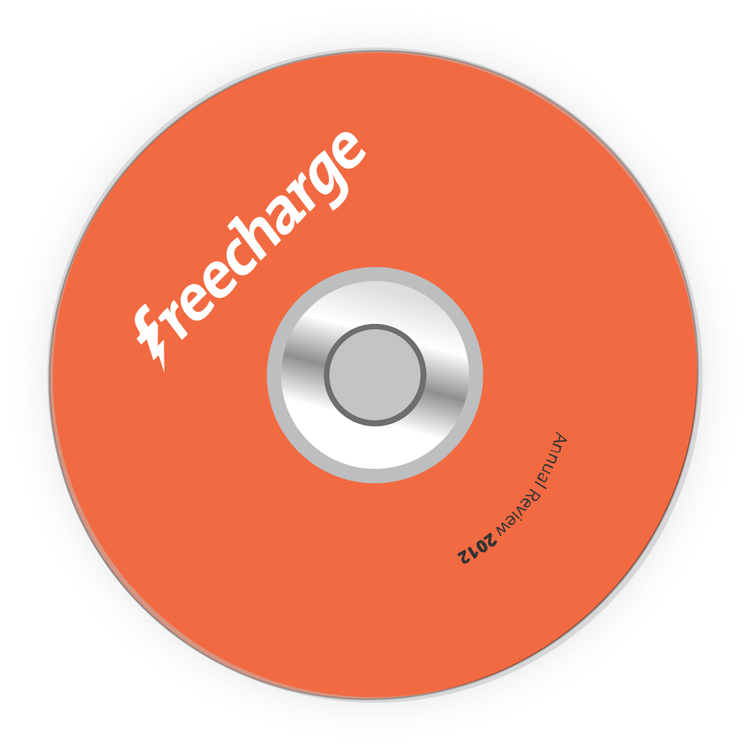
Stationery & Collateral
Apart from the logo mark and guidelines for the brand, I also developed stationery and other collateral.